-
Quality Function Design of electric batteries through Data Analysis
As modern day product become increasingly complex one must be conscious of all the featural characteristics that define its employment and value; these are basically raised by the potential market. The producer is compelled to translate these consumer concerns into technical requirements; which are always bound to quantification. These elements will be seen as manageable outputs derived from the activities that hold up the organization. One must strive to visualize these, as prime materials for the drafting mission statements within companies.
The upcoming piece will demonstrate that through the thorough appliance of statistical tools and Quality Function Design (DFMEA) thinking, one can depart from public data to distil value according to market demands; by compounding it with six sigma, one can backwardly flesh out the product endgame from the clients necessities to its conceptual inception, and its subsequent operation, as this work will explain. The paramount tenet of quality control and the Quality Function Design (QFD) is to understand that these market demands stem out from manageable variables, and it will all kick off by ranking consumer preferences. One asks: what are the chief concerns of consumers? also known as the Voice of Consumer (VOC). The quality professional must take upon himself the task of translating these concerns into measurable engineering variables or Critical To Quality parameters (CTQ’s). Furthermore, these are linked to operating conditions or x values (How we achieve these objectives?).
The object of the study is a publicly available dataset (Failure Surfaces in Battery Energy Storage Systems) regarding the lifecycle of batteries under variegated operational conditions-can it be improved through the manipulation of certain variables?- recent polling exercises indicate that 57% of drivers intend to acquire an electric vehicle within a decade; therefore, the pertinence of quality control, safety and survival models ought to be extended to these new developments; as it was for the fossil fuel precedents.
The set amounts for a total of 477250 entries and eleven operational parameters (chemistry,cycle, charge_rate, discharge_rate, cell_temperature, internal resistance in ohms, capacity retention, cumulative high temp cycles, fast charge exposure cycles, irreversible damage index and thermal runaway risk score). What value can one extract from such variables? One commences by resorting to the wisdom of the crowds.
What People want in electric car batteries?(source: More than 50% of drivers expect to own an electric car by 2034)
Concern/Voice of customer % people Reliability 83 Safety 82 Value for money 82 Charging infrastructure 70 The third and fourth variable are immediately ruled out, the latter due to its membership to the public investment domain and the former for information constraints in the dataset.
The problem statement will be vaguely based on the QFD technique; hence we take these two high ranking priorities and proceed to find the quantifiable feature inside the data set at hand.
What defines such Quality?
VOC/What? How/CTQ Reliability % Capacity retention Safety Thermal runaway score (o to 1) Capacity retention in this realm is the best parameter for determining the functionality or lifespan of the battery. In regards to safety, batteries may combust due to dramatic temperature spikes.
ciclos=bateria['cycle']capacity=bateria['capacity_retention_%']sns.lineplot(data=bateria, x=ciclos,y=capacity, hue='cell_chemistry')plt.ylabel('capacity')plt.xlabel('ciclos')plt.title('Capacity retention during cycles')plt.show()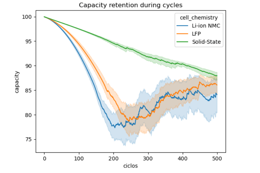
Figure 1 Evolution along time-cycles It is self-evident that the Solid state chemistry is significantly more reliable than Lithium and LFP which seem quite similar. These previous graph is quite illustrative, and one should add an extra layer of analysis; it should be done in a standardized fashion. By means of the Central Limit Theorem, one can take random samples of the global population, and obtain an bell shaped curve.
lithium=[]for i in range(10000):lithium_array=np.random.choice(Li['capacity_retention_%'],size=100,replace=True)lithium_array_mean=np.mean(lithium_array)lithium.append(lithium_array_mean)lithium=np.sort(lithium)lfp_norm=[]for i in range(10000):lfp_array=np.random.choice(lfp['capacity_retention_%'],size=100,replace=True)lfp_array_mean=np.mean(lfp_array)lfp_norm.append(lfp_array_mean)lfp_norm=np.sort(lfp_norm)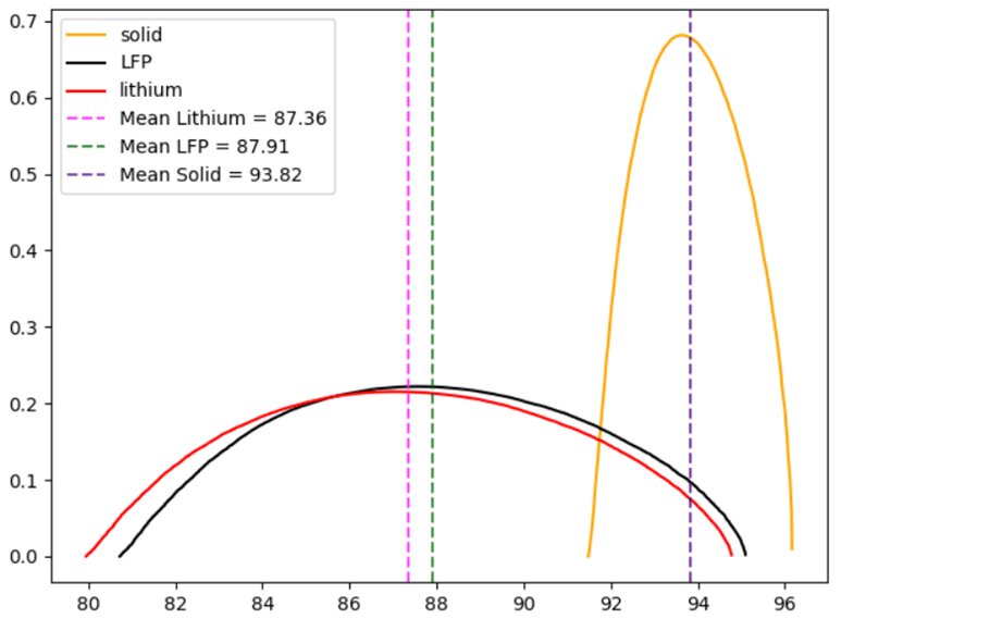
Figure 2 Standardized plots of each chemistry Through this standard form one can get a better grasp of the differences of the three chemistries. It can be confirmed now that Solid Chemistry is absolutely more competent than the remaining two.
Mean Standard deviation Chemistry 93.82 0.58 Solid -State 87.32 1.83 Lithium 87.90 1.79 LFP Table 1 Parameters for the standardized distributions of the three chemistries
What is the solid state performance vis a vis lithium?
With the assistance of the Z-score formula , one may compute where does the mean solid lie in regards to the spread of the lithium data (standard deviation); solid state chemistry takes the x- value, and get that the solid state battery lies 3.52 standard deviations ahead of the lithium mean; another interpretation is to position the solid mean within the upper .02% of the lithium set. Between Lithium and LFP there is no significant difference in this performance. An additional plus for the solid is the narrowness of distribution contrasting the wideness of the spread of the other two. Thus having better process capacity. As figure 1 portrayed, there is a stark collapse in capacity in LFP or Lithium batteries, this situation merits greater depth in its causalities. For this objective, a Response Surface Methodology will be utilized.
SEED = 42np.random.seed(SEED)FACTORES = ['charge_rate_C', 'discharge_rate_C', 'cell_temperature_C','internal_resistance_mOhm', 'irreversible_damage_index']COVARIABLE = 'cycle'TODOS = FACTORES + [COVARIABLE]RESPUESTA = 'capacity_retention_%'LABELS = {'charge_rate_C' : 'Charge Rate (C)','discharge_rate_C' : 'Discharge Rate (C)','cell_temperature_C' : 'Temperatura (°C)','internal_resistance_mOhm' : 'Resistencia Interna (mOhm)','irreversible_damage_index': 'Daño Irreversible','cycle' : 'Ciclo'}COLORES = {'Li-ion NMC': '#FF8F00', 'LFP': '#2E7D32'}bateria_rms=bateria[(bateria['cell_chemistry']=='LFP')|(bateria['cell_chemistry']=='Li-ion NMC')]C# 2. FUNCIÓN RSM — reusable chemistry# -----------------------------------------------------------------------------def ajustar_RSM(nombre, df_q, n_max=50000, seed=SEED):print(f"\n{'='*65}")print(f"RSM — {nombre} | RESPUESTA: capacity_retention_%")print(f"{'='*65}")print(f"Registros totales : {len(df_q):,}")print(f"Retención media : {df_q[RESPUESTA].mean():.2f}%")print(f"Retención std : {df_q[RESPUESTA].std():.2f}%")print(f"Rango : {df_q[RESPUESTA].min():.2f}% – {df_q[RESPUESTA].max():.2f}%")# Submuestreo estratificado por rango de retencióndf_q = df_q.copy()df_q['ret_bin'] = pd.cut(df_q[RESPUESTA],bins=[0,60,70,80,85,90,95,100],labels=['0-60','60-70','70-80','80-85','85-90','90-95','95-100'])prop = df_q['ret_bin'].value_counts(normalize=True)muestra = []for bin_label, proporcion in prop.items():n_bin = max(int(n_max * proporcion), 50)sub = df_q[df_q['ret_bin'] == bin_label]muestra.append(sub.sample(n=min(n_bin, len(sub)), random_state=seed))df_m = pd.concat(muestra).sample(frac=1, random_state=seed).reset_index(drop=True)print(f"Submuestreo : {len(df_m):,} registros (estratificado)")X = df_m[TODOS].astype(float)y = df_m[RESPUESTA].astype(float)X_tr, X_te, y_tr, y_te = train_test_split(X, y, test_size=0.30, random_state=seed)# Pipelinepipe = Pipeline([('scaler', StandardScaler()),('poly', PolynomialFeatures(degree=2, include_bias=False)),('model', LinearRegression())])pipe.fit(X_tr, y_tr)y_pred_tr = pipe.predict(X_tr)y_pred_te = pipe.predict(X_te)r2_tr = r2_score(y_tr, y_pred_tr)r2_te = r2_score(y_te, y_pred_te)rmse = np.sqrt(mean_squared_error(y_te, y_pred_te))cv = cross_val_score(pipe, X, y, cv=5, scoring='r2', n_jobs=-1)print(f"\n--- MÉTRICAS ---")print(f"R² Train : {r2_tr:.4f}")print(f"R² Test : {r2_te:.4f}")print(f"RMSE Test : {rmse:.4f}%")print(f"CV R² (5-fold) : {cv.mean():.4f} ± {cv.std():.4f}")# Coeficientespoly_step = pipe.named_steps['poly']model_step = pipe.named_steps['model']feat_names = poly_step.get_feature_names_out(TODOS)coefs = model_step.coef_intercepto = model_step.intercept_coef_df = pd.DataFrame({'termino' : feat_names,'coeficiente': coefs,'abs_coef' : np.abs(coefs)}).sort_values('abs_coef', ascending=False)# Separar efectoslineales = coef_df[~coef_df['termino'].str.contains(' ') &~coef_df['termino'].str.contains('^2', regex=False)]cuadraticos = coef_df[coef_df['termino'].str.contains('^2', regex=False)]interacciones = coef_df[coef_df['termino'].str.contains(' ') &~coef_df['termino'].str.contains('^2', regex=False)]print(f"\n--- EFECTOS LINEALES ---")print(f" Intercepto: {intercepto:.4f}")for _, row in lineales.iterrows():signo = '+' if row['coeficiente'] > 0 else ''print(f" {row['termino']:<40} {signo}{row['coeficiente']:.4f}")print(f"\n--- EFECTOS CUADRÁTICOS (curvatura) ---")for _, row in cuadraticos.iterrows():signo = '+' if row['coeficiente'] > 0 else ''print(f" {row['termino']:<40} {signo}{row['coeficiente']:.4f}")print(f"\n--- INTERACCIONES (top 5) ---")for _, row in interacciones.head(5).iterrows():signo = '+' if row['coeficiente'] > 0 else ''print(f" {row['termino']:<40} {signo}{row['coeficiente']:.4f}")# Optimizaciónn_grid = 15grilla = {f: np.linspace(df_q[f].quantile(0.05),df_q[f].quantile(0.95), n_grid) for f in FACTORES}grilla[COVARIABLE] = [df_q[COVARIABLE].median()]from itertools import productcombos = list(product(*[grilla[f] for f in TODOS]))df_grilla = pd.DataFrame(combos, columns=TODOS)if len(df_grilla) > 200000:df_grilla = df_grilla.sample(200000, random_state=seed)df_grilla['pred'] = pipe.predict(df_grilla[TODOS])opt = df_grilla.loc[df_grilla['pred'].idxmax()]print(f"\n--- CONDICIONES ÓPTIMAS (cycle fijo en mediana={df_q[COVARIABLE].median():.0f}) ---")for f in FACTORES:print(f" {LABELS[f]:<35}: {opt[f]:.3f}")print(f" Retención predicha máxima : {opt['pred']:.2f}%")print(f" Retención media observada : {df_q[RESPUESTA].mean():.2f}%")print(f" Ganancia sobre la media : +{opt['pred'] - df_q[RESPUESTA].mean():.2f}%")return {'nombre' : nombre,'pipe' : pipe,'coef_df' : coef_df,'lineales' : lineales,'cuadraticos': cuadraticos,'interacciones': interacciones,'intercepto': intercepto,'r2_te' : r2_te,'rmse' : rmse,'cv' : cv,'opt' : opt,'df_q' : df_q,'y_te' : y_te,'y_pred_te' : y_pred_te,'residuales': y_te.values - y_pred_te}# -----------------------------------------------------------------------------# 3. AJUSTAR MODELOS# -----------------------------------------------------------------------------df_nmc = df[df['cell_chemistry'] == 'Li-ion NMC'].copy()df_lfp = df[df['cell_chemistry'] == 'LFP'].copy()res_nmc = ajustar_RSM('Li-ion NMC', df_nmc)res_lfp = ajustar_RSM('LFP', df_lfp)=================================================================RSM — Li-ion NMC | RESPUESTA: capacity_retention_%=================================================================Registros totales : 127,884Retención media : 87.36%Retención std : 18.40%Rango : 0.00% – 99.99%Submuestreo : 49,997 registros (estratificado)--- MÉTRICAS ---R² Train : 0.9180R² Test : 0.9215RMSE Test : 4.2308%CV R² (5-fold) : 0.9189 ± 0.0025In the lithium case we have that the RSM output model accounts for 92% of the variation in the response variable--- EFECTOS LINEALES ---Intercepto: 88.6471irreversible_damage_index -7.0603internal_resistance_mOhm -4.6517cycle -3.1735charge_rate_C -2.4596discharge_rate_C -0.3770cell_temperature_C -0.0774--- EFECTOS CUADRÁTICOS (curvatura) ---internal_resistance_mOhm^2 -2.2649cycle^2 +1.1885discharge_rate_C^2 -0.1820irreversible_damage_index^2 +0.1305charge_rate_C^2 +0.0887cell_temperature_C^2 +0.0122--- INTERACCIONES (top 5) ---internal_resistance_mOhm irreversible_damage_index +1.2444charge_rate_C irreversible_damage_index +0.4329charge_rate_C cycle -0.3362irreversible_damage_index cycle +0.3153discharge_rate_C cycle -0.2325--- CONDICIONES ÓPTIMAS (cycle fijo en mediana=159) ---Charge Rate (C) : 0.500Discharge Rate (C) : 0.500Temperatura (°C) : 26.297Resistencia Interna (mOhm) : 34.920Daño Irreversible : 0.000Retención predicha máxima : 98.69%Retención media observada : 87.36%Ganancia sobre la media : +11.33%All of the variables hold a negative relation with the % capacity. Both damage index and resistance have a negative impact on the capacity at the individual level and in coupling interactions.
=================================================================
RSM — LFP | RESPUESTA: capacity_retention_%
=================================================================
Registros totales : 159,338
Retención media : 87.91%
Retención std : 17.97%
Rango : 0.00% – 99.99%
Submuestreo : 49,996 registros (estratificado)
--- MÉTRICAS ---
R² Train : 0.9119
R² Test : 0.9137
RMSE Test : 4.3846%
CV R² (5-fold) : 0.9122 ± 0.0018
In the case of the Lfp battery, the model explains 91% of the variables
--- EFECTOS LINEALES ---
Intercepto: 89.7591
irreversible_damage_index -9.1769
internal_resistance_mOhm -4.5150
cycle -2.7876
charge_rate_C -2.3995
discharge_rate_C -0.3559
cell_temperature_C -0.1349
--- EFECTOS CUADRÁTICOS (curvatura) ---
internal_resistance_mOhm^2 -3.4782
cycle^2 +1.0695
charge_rate_C^2 -0.4634
irreversible_damage_index^2 -0.2764
discharge_rate_C^2 +0.0295
cell_temperature_C^2 -0.0205
--- INTERACCIONES (top 5) ---
internal_resistance_mOhm irreversible_damage_index +3.2411
charge_rate_C irreversible_damage_index +0.7403
internal_resistance_mOhm cycle +0.5884
discharge_rate_C internal_resistance_mOhm +0.4751
discharge_rate_C irreversible_damage_index -0.3603
--- CONDICIONES ÓPTIMAS (cycle fijo en mediana=199) ---
Charge Rate (C) : 0.500
Discharge Rate (C) : 0.500
Temperatura (°C) : 33.354
Resistencia Interna (mOhm) : 41.891
Daño Irreversible : 0.000
Retención predicha máxima : 98.39%
Retención media observada : 87.91%
Ganancia sobre la media : +10.48%
As in the lithium battery one gets that the damage index and resistance are highest ranking triggers.
Graphic Surface with optimal parameters
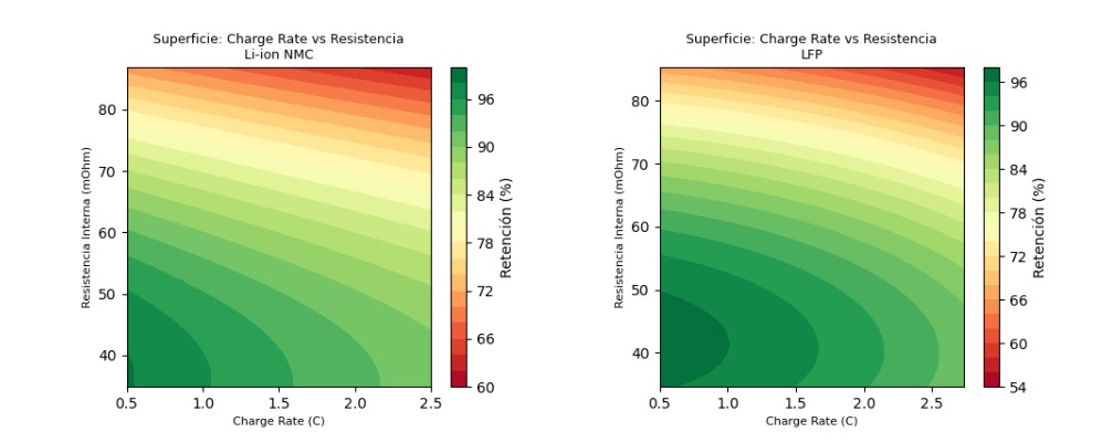
Figure 3 Response surface defined by charge rate and Resistance. The Lfp has little more tolerance for resistance and charge rate. II. CTQ SAFETY/Thermal runaway
ciclos=bateria['cycle']fuga=bateria['thermal_runaway_risk_score']sns.lineplot(data=bateria, x=ciclos,y=fuga, hue='cell_chemistry')plt.ylabel('damage')plt.xlabel('exposure')plt.title('thermal runaway/cycle')plt.show()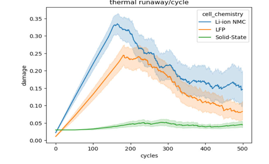
Figure 4: Thermal runaway average per cycle A plain visual inspection plot shows once again that the solid state battery grants safer conditions. Both lithium and phosphate show signs of weariness even before reaching their half-life. For the safety concern, the analysis will focus solely in the solid state battery, because of the overwhelming security it provides along the operation. Given its safety, one should ask what are the conditions that will induce the thermal runaway. What connection does the thermal runaway hold with the other 10 variables? The most straight forward technique will be to assess the linear relationship of such response variable.
solid_heat_map = solid.select_dtypes(include=[np.number])solid_na=solid_heat_map.dropna()solid_na.drop('cumulative_high_temp_cycles', axis =1, inplace = True)corr_solid = solid_na.corr()diagonal_solid = np.triu(np.ones_like(corr_solid, dtype=bool))plt.figure(figsize=(15, 13))sns.heatmap(corr_solid,mask=diagonal_solid,cmap='coolwarm',annot=True,fmt=".2f",square=True,linewidths=.5,cbar_kws={"shrink": .8})plt.title('Correlation Heatmap-solid state (Lower Triangle)')plt.show()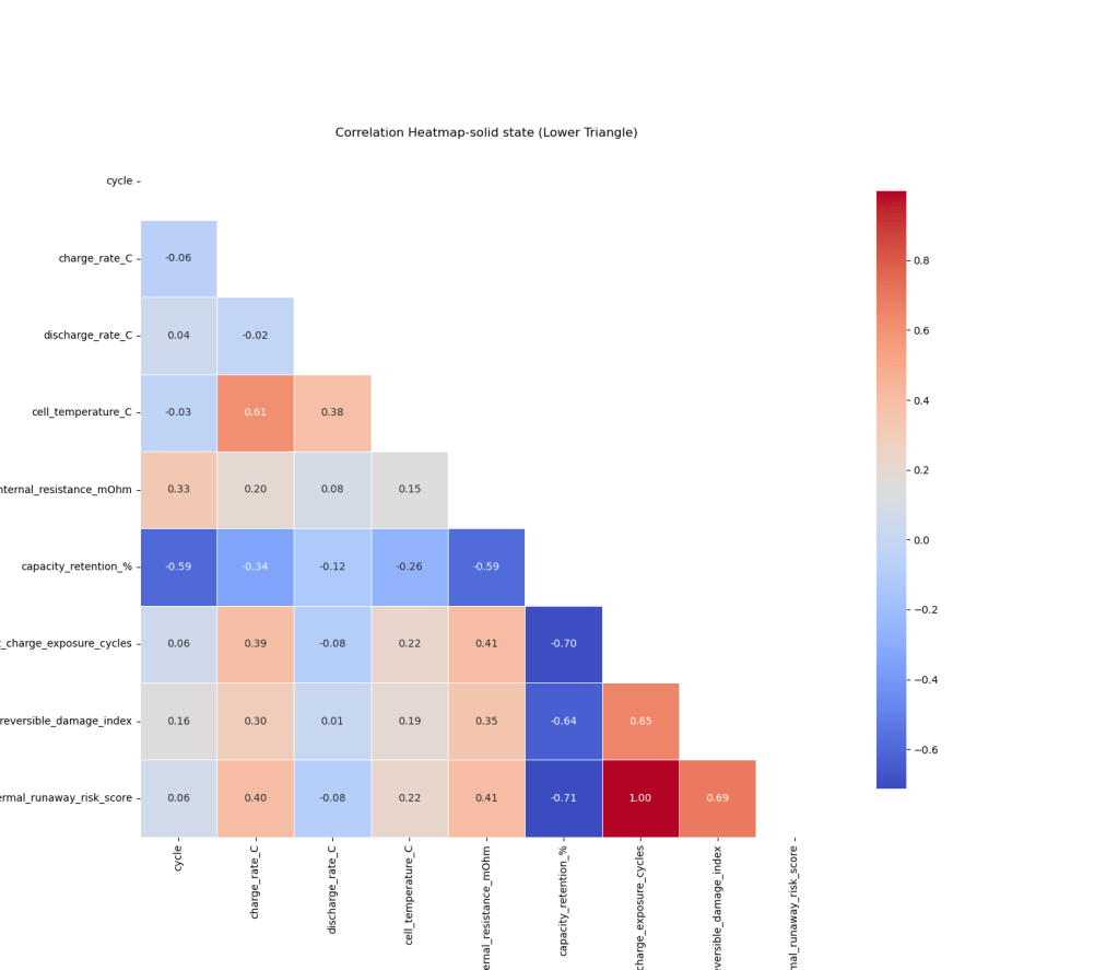
Figure 5: Heatmap of the Solid state battery According to the last line there are two strong correlations: irreversible damage index and charge exposure cycle. A 1:1 relation would not be useful, because it will just replace the thermal runaway without adding additional value; lastly the irreversible_damage_index, as one might expect, has a strong linear linkage. The second layer of analysis will evaluate the interplay between the factors and its bearing upon the thermal runaway variable. The procedure will divide the thermal runaway failure in different categories:
(0.45-.60) moderate risk
(0.60-.70) high risk
(0.70-.80) severe risk
(0.80-0.90) critical risk
(0.90-1) catastrophic risk
One only gets a 0,76% of unsafe batteries; which are broken down in the earlier risk labels. Applying this criteria, there are just 169 batteries with critical and catastrophic labels.
# Clasificar por nivel de severidadbins = [0.45, 0.60, 0.70, 0.80, 0.90, 1.01]labels = ['0.45-0.60 (moderado)', '0.60-0.70 (alto)','0.70-0.80 (severo)', '0.80-0.90 (crítico)','0.90-1.00 (catastrófico)']risk['severidad'] = pd.cut(risk['thermal_runaway_risk_score'],bins=bins, labels=labels)RESPUESTA = 'thermal_runaway_risk_score'print("=" * 65)print("PERFIL INTERNO DE FALLOS — SOLID-STATE")print("=" * 65)print(f"Casos analizados: {len(risk):,} (thermal_runaway >= 0.45)")print(f"\nDistribución por severidad:")for lab, n in risk['severidad'].value_counts().sort_index().items():pct = n / len(risk) * 100print(f" {lab:<35}: {n:>4} ({pct:.1f}%)")What drives the battery failure?
Once again, the application of the correlation coefficients will be used exclusively in those 1462 faulty cases
=================================================================
PERFIL INTERNO DE FALLOS — SOLID-STATE
=================================================================
Casos analizados: 1,463 (thermal_runaway >= 0.45)
Distribución por severidad:
0.45-0.60 (moderado) : 882 (60.3%)
0.60-0.70 (alto) : 270 (18.5%)
0.70-0.80 (severo) : 141 (9.6%)
0.80-0.90 (crítico) : 59 (4.0%)
0.90-1.00 (catastrófico) : 110 (7.5%)
# 5. ÁRBOL DE REGRESIÓN — reglas de severidad# -----------------------------------------------------------------------------print(f"\n{'='*65}")print("ÁRBOL DE REGRESIÓN — REGLAS DE SEVERIDAD")print(f"{'='*65}")cart_reg = DecisionTreeRegressor(max_depth=3, random_state=SEED,min_samples_leaf=20)cart_reg.fit(X, y)print(export_text(cart_reg, feature_names=[LABELS[f] for f in FACTORES]))imp = pd.Series(cart_reg.feature_importances_,index=[LABELS[f] for f in FACTORES]).sort_values(ascending=False)print("IMPORTANCIA DE VARIABLES (árbol de regresión):")for var, val in imp.items():if val > 0:barra = '█' * int(val * 40)print(f" {var:<35}: {val:.4f} {barra}")=================================================================ÁRBOL DE REGRESIÓN — REGLAS DE SEVERIDAD=================================================================|--- Resistencia Interna (mOhm) <= 106.81| |--- Charge Rate (C) <= 3.01| | |--- Charge Rate (C) <= 2.76| | | |--- value: [0.46]| | |--- Charge Rate (C) > 2.76| | | |--- value: [0.47]| |--- Charge Rate (C) > 3.01| | |--- Resistencia Interna (mOhm) <= 73.04| | | |--- value: [0.52]| | |--- Resistencia Interna (mOhm) > 73.04| | | |--- value: [0.63]|--- Resistencia Interna (mOhm) > 106.81| |--- Resistencia Interna (mOhm) <= 130.04| | |--- Charge Rate (C) <= 3.36| | | |--- value: [0.66]| | |--- Charge Rate (C) > 3.36| | | |--- value: [0.83]| |--- Resistencia Interna (mOhm) > 130.04| | |--- Resistencia Interna (mOhm) <= 141.68| | | |--- value: [0.94]| | |--- Resistencia Interna (mOhm) > 141.68| | | |--- value: [1.00]IMPORTANCIA DE VARIABLES (árbol de regresión):Resistencia Interna (mOhm) : 0.8742 ██████████████████████████████████Charge Rate (C) : 0.1258 █████As one might appreciate from the previous decision tree, when the resistance increases above 130 combustion is basically a fait accompli.
One now grasps which variables induce the greatest thermal risk in the battery; for the sake of achieving greater formality, an FMEA (Failure mode and effects analysis) will be executed basing it on the 5 failure criteria; the probability will be calculated on the incidence within the 1463 population.
FMEA occurrence
Mode Cases % Occurrence Description Moderate 882 60.3% 8 Very frequent High 270 18.5% 6 frequent Severe 141 9.6% 5 moderate Critical 59 4.0% 3 unfrequent Catastrophic 110 7.5% 4 rare Table 3 occurrence
Detection values will be assigned based on the measurability of the key variables identified in the regression tree. Internal resistance and charge rates are continuously monitored parameters in modern Battery Management Systems, granting hight detectability at lower security levels. As severity escalates the window for detection will narrow.
Failure mode Severity Occurrence Detection npr Catastrophic 10 4 6 240 Severe 7 5 4 140 Moderate 5 8 2 80 High 6 6 3 108 Critical 8 3 5 120 Table 4 FMEA
Given the figure 5 output and the decision tree, one gets the following criteria for the 5 classifications:
-Moderate , RPN=80
Key variable: charge rate
Threshold: charge rate > 3.01
Action: Establish a charge rate limit of 3.01
-High, RPN 108
Key variable: internal resistance and charge rate
Threshold: Resistance above 73
Action: raise cautionary flag at 73 mohms
-Severe, RPN 140
Key variable : internal resistance
Threshold: Resistance above 107
Action: Reduce charge
-Critical, RPN 120
Key variable: charge rate + internal resistance
Secondary variable: irreversible damage index
Threshold: Resistance > 107 and charge rate >3.36
Action: immediate charge suspension
-Catastrophic, RPN 240
Key variable: Internal resistance
Threshold: internal resistance > 130
Action: Suspend operation replace unit
A swift recapitulation of the previous work: departing from market requirements, one find its respective critical to quality engineering counterpart. The first step is compare the batteries according to its three different chemistries. The following outcomes are achieved:
- Through the statistical Response Surface Methodology technique one gets which variables can be manipulated in order to monitor the performance. The model has more than 90% precision.
- From a very brief visualization is quite clear that the solid state battery is far more competent in terms of its capacity retention. The distance between standardized means statistically proves this. When it comes to safety, the solid state battery has greater lifespan and less risks
- Both CTQ´s can be monitored through the assessment of the same variables which can simplify the assurance job (resistance, charge rate and irreversible damage index) besides the obvious time frame or cycle.
Quality Control does not end at the shipping dock inside the manufacturing facility; it involves post-sales service and proper usage counselling for the user; always aiming at maximizing lifespan and minimizing costs. Through Quality function Design the consumer can grant itself with valuable cautionary points that will assist him or her in achieving the purported goals for which, in this case, the battery was acquired.
-
Service Levels in transportation through an A/B lens
R and pandas library in Python
Diversifying sales and client communication into a wide array of chanels is a useful way to maximize profit through the improvement of Service Levels; «SL» is a rational and quantitative element which evaluates the peformance delivered to the customer base. In the incumbent endeavour, one is presented with a dataset rooted in a transportation company´s customer-order entrances; such entrances or chanels will be divided into three: Website message board, executives Emails, and a web whatsapp chat.
The dataset collection will follow a quite conventional sales report layout: a customer name, Tax id, number of order, date of registration, the executive assigned to the service request amongst other variables irrelevant to the scope of this examination. The data comprised stems from the period of July 2015 to June 2016. The key variable will be the «valor venta» column, which is spanish for sales value. Negative values will mean that the particular order was not fulfilled, the quotation was logged into the system with all the required parameters by one of the three chanels, but due to snags in the response procedure, the customer balked from the order; therefore generating an «opportunity» sale. The invoice value will differ greatly from one order to another, all freight services will have the port of Manzanillo, Mexico as its departure point and destinations will be strewn across the entire Mexican Republic,as for the cargo description, it could be a twenty-foot container, forty or LCL goods, hence the ample cost variation. As stipulated earlier, the desired outcome will be the comparison parameter named Service Level between the three entry chanels of the customer order. Sales variation depending on the first point of contact between the potential customer and the organization: «A» ,for website message board; B, for executives emails, lastly «C» for whatsapp chat run by a manager adjutant.
The service level will be nothing more than a quotient between the actual orders delivered and the total amount of orders entered into the system; simple addition of the opportunity sales and those already fullfilled.
Importing libraries
import pandas as pd
import datetime as dt
import numpy as np
With this chunk of code one obtains the preliminary look of the dataset sales_dataset=pd.read_csv(r'C:\Users\Alonso\Downloads\VENTAS CLIENTES.csv')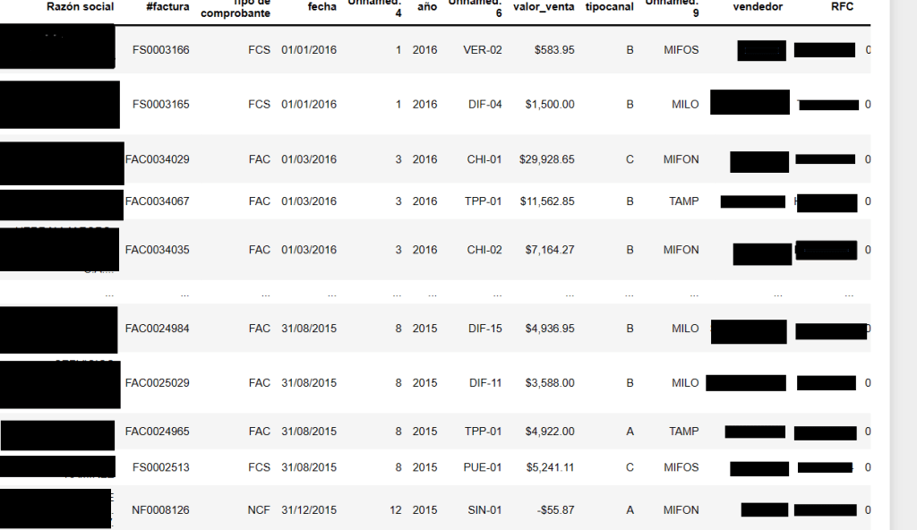
Image 1: General glance of the de initial dataset, personal data has been concealed For the sake of fairness, one must be sure that the order input are equaly distributed amongst the three chanels . The ninth column from left to right- «tipocanal» spanish for chanel type- labels the entrance into the system («A», «B», and «C»).
chanel_types_prop=sales_dataset_date['tipocanal'].value_counts(normalize=True)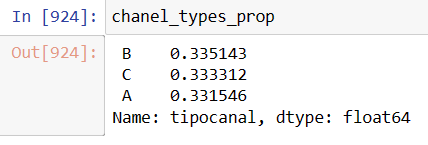
Image 2: Clearly the order distribution is evenly distributed into the three entry points Perusing the first image, one sees that the eight column «valor_venta» or sales value has commas and the the $ mexican peso symbol. Both characters should be removed and transform into a float variable with a new column named ‘invoice_value’.
sales_dataset_date['invoice_value']=sales_dataset_date['valor_venta'].replace('[\$,]','', regex=True).astype(float)Next step will be to see the values behaviour across time with R Studio. This task will only require three columns of the prior dataset: «Date», «invoice_value» and «chanel type. It will be later transformed into a csv file.
sales_dataset_date_yr=sales_dataset_date[['fecha','invoice_value','tipocanal']]sales_dataset_date_yr.to_csv(r"C:\Users\Alonso\Desktop\doe3.csv")In R three libraries will be downloaded: lubridate, for date format transformation; dplyr, for manipulating the three imported columns, and ggplot2 for creating plots.
library(lubridate)
library(dplyr)
library(ggplot2)
doe3$month<-format(as.Date(doe3$fecha, format="%Y-%m-%d","%m"))
doe3$month<-month(doe3$fecha)
doe3$year_month<-format(as.Date(doe3$month),format="%Y-%m")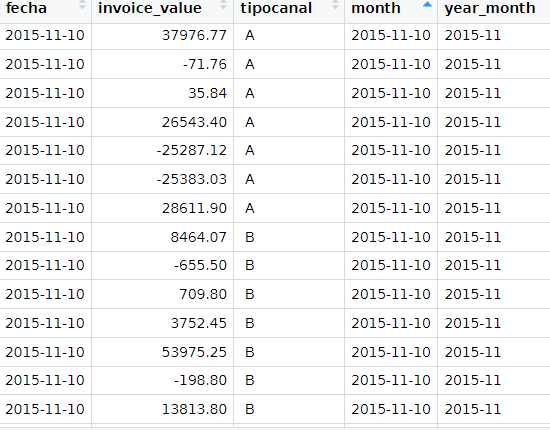
Image3: Output for the data transformation in R denominated doe3. It includes actual sales and opportunity sales. By applying the dplyr library, an average of actual services delivered and lost ones will be created in a monthly basis.
#Positive values time_series_yr_ch<-doe3%>% group_by(year_month,tipocanal)%>% summarize(avg=mean(invoice_value))#Negative values time_series_yr_ch_loss<-doe3%>% group_by(year_month,tipocanal)%>% filter(invoice_value< 0)%>% summarize(aver=mean(invoice_value))Time Series Plots
time_series_yr_ch%>% ggplot()+ geom_line(aes(year_month,avg, colour=tipocanal,group=tipocanal,size=2))+theme(legend.position = "bottom", legend.key.size = unit(2,'cm'),legend.key.height = unit(2,'cm'),legend.key.width = unit(2,'cm'))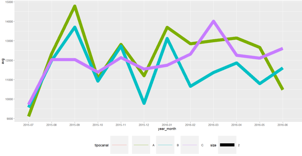
Image 4: A time series average of the three input chanels for delivered freights time_series_yr_ch_loss%>% ggplot()+ geom_line(aes(year_month,aver, colour=tipocanal,group=tipocanal,size=2))+theme(legend.position = "bottom", legend.key.size = unit(2,'cm'),legend.key.height = unit(2,'cm'),legend.key.width = unit(2,'cm'))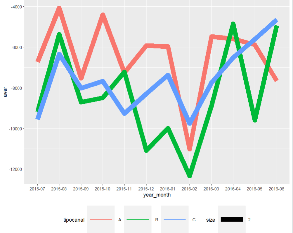
Image 5: Time series average for lost sales. Clearly february of 2016 there was a dramatic drop in the three chanels. With A and B leading the losses In order to create a semblance of the required Service Level indicator an export of the R dataset will take place back into python through a csv.file
write.csv(b_chanel_sales,"C:\\Users\\Alonso\\Desktop\\b_chanel_sales.csv",row.names=FALSE) write.csv(b_chanel_loss,"C:\\Users\\Alonso\\Desktop\\b_chanel_loss.csv",row.names=FALSE)#One reintroduces the R datasets into python b_chanel_sales_dataset=pd.read_csv(r'C:\Users\Alonso\Desktop\b_chanel_sales.csv') b_chanel_sales_loss=pd.read_csv(r'C:\Users\Alonso\Desktop\b_chanel_loss.csv')#Transform the opportunity values to positive ones by multiplying it times -1 b_chanel_sales_dataset['opp_sale']=b_chanel_sales_loss['negavg']*-1With these to variables one can proceed to compute the service level, for instance in «B» chanel in a monthly basis.
# The Service Level quotient
b_chanel_sales_dataset['service_level']= b_chanel_sales_dataset['avg']/(b_chanel_sales_dataset['opp_sale']+b_chanel_sales_dataset['avg'])
Image 6: Through the previous code, one calculates the Service Level indicator. As seen in the opportunity sales average graph, February 2016 has one the lowest Service Levels. In order to attain greater statistical formality, one should compare the three chanels in a same parametric basis. When reviewing the theoretical background, we utilize the Central Limit Theorem, which states that regardless of the distribution of a given dataset; if one extracts random units, proceeds to computes their means, repeats this process for a few iterations, such outputs will build a new dataset;which will follow a normal distribution. The following code example will demonstrate that.
# To remove emty values, we apply the following function:

sales_dataset_nna=sales_dataset_date.dropna()
The next step will be to create 2000 means from 5 random positive invoice values from each chanel, and insert them into an empty list. These values will generate the numerator for the Service Level quotient, and the same process will be carried out for the negative values; which added to the positive ones will equate the denominator.
sample_means_c=[]
for i in range(2000):
              sample_positive_c=sales_dataset_nna[(sales_dataset_nna['tipocanal'] == ' C') & (sales_dataset_nna['invoice_value']>0)]['invoice_value'].sample(5, replace=True)
             sample_mean=np.mean(sample_positive_c)
             sample_means_c.append(sample_mean)
The same for negative values.
sample_means_c_neg=[] for i in range(2000): sample_negative_c=sales_dataset_nna[(sales_dataset_nna['tipocanal'] == ' C') & (sales_dataset_nna['invoice_value']<0)]['invoice_value'].sample(5, replace=True) sample_negative_c=sample_negative_c*-1 sample_mean=np.mean(sample_negative_c) sample_means_c_neg.append(sample_mean)service_level_numerator_c=sample_means_cservice_level_denominator_c=np.add(sample_means_c,sample_means_c_neg)service_level_c=service_level_numerator_c/service_level_denominator_cDeparting from the previous service level vector for each chanel, a recreation of the sampling process will take place by the application of the random function created for both the numerator and the denominator; this time applied to the Service Level quotient for the «C» chanel.
means_service_level_c=[]
for i in range(1000):
    c_service_prop_array=np.random.choice(service_level_c, size=5, replace=True)
    c_service_level_mean=np.mean(c_service_prop_array)
    means_service_level_c.append(c_service_level_mean)
To visualize the distribution of the previous means array, «means_service_level_c», one ought to plot a histogram in order to prove the apparent normality.
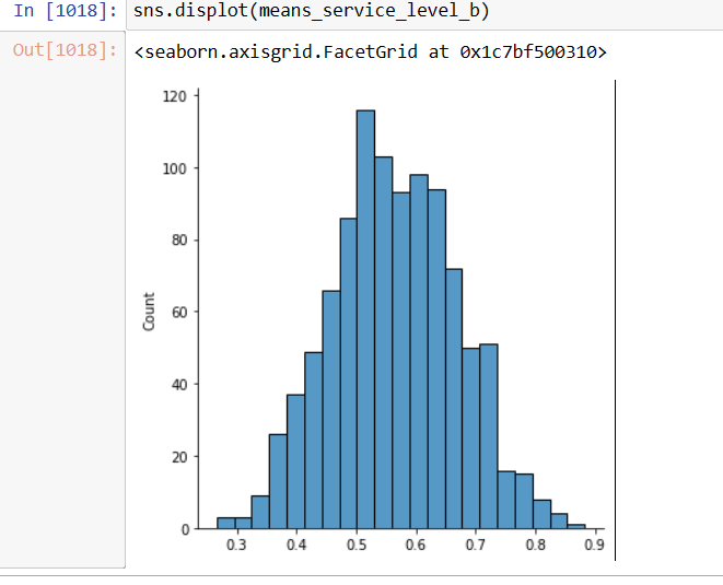
Image 7: The distribution for the means service level seems quite normal, as it is quite symmetric around the mean. The same criteria applies to chanes «A» and «B». Displaying the Service Levels of the three chanels as Normal Plots
Arriving to the final stage of the research, one should plot three curves from the three different mean service levels using the standard deviation and the mean as defining parameters of the normal distribution.
As independent or x variable, we create an array from the lowest possible service level to the highest up to 95% with a length of 1000, proceed with the computation of the means and standard deviation for each chanel; labeling them as a_bar, b_bar, and c_bar respectively.
x=np.linspace(0.15,0.95,1000)
a_bar=np.mean(means_service_level_a)
b_bar=np.mean(means_service_level_b)
c_bar=np.mean(means_service_level_c)
Now, compute the probability density function with these four variables plus the «sd» or standard deviation.
norm_a=norm.pdf(x,a_bar,np.std(means_service_level_a))
norm_b=norm.pdf(x,b_bar,np.std(means_service_level_b))
norm_c=norm.pdf(x,c_bar,np.std(means_service_level_c))
With the probability density function and feature parameters, one can draw the three curves centered around their means named as «a_bar», «b_bar», and «c_bar» plotted also as dotted lines.
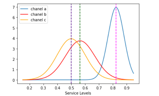
Image 8: The visual differences are quite notorious amongst the three order entry chanels import matplotlib.pyplot as plt sns.lineplot(x,norm_a,label='chanel a') sns.lineplot(x,norm_b, color='red',label='chanel b') sns.lineplot(x,norm_c, color='orange',label='chanel c') plt.axvline(x=a_bar,color='fuchsia',linestyle='--') plt.axvline(x=b_bar,color='darkgreen',linestyle='--') plt.axvline(x=c_bar, color='indigo',linestyle='--') plt.xlabel('Service Levels') plt.show()It is quite conspicuous that «A», or the website message board has the highest fulfillment rate and greater follow up of customer orders as it travels along the company´s system.
For the analysis to be framed in a more quantitative scope, z-score formula will be used to determine the spread between the three chanels . The «C» option, Whatssapp chat, will be the pivot point due to its further left value. How many «C chanel» standard deviations are the other two mean values swayed to the right ?
Image 9: Z score standard formula for measuring the spread of the three chanels means z_a_chanel_score=(a_bar-c_bar)/np.std(means_service_level_c) z_b_chanel_score=(b_bar-c_bar)/np.std(means_service_level_c)Computing this last chunk of code, one gets the distance of the «A» and «B» with respect to C. The former is equal to 3.17 sd and the latter is equal to 0.63. One can clearly state that those customer requests entering the system through the website message board will have a far greater chance of becoming income stream than those by email or whatsapp chat, both having practically the same service level (0.49 and 0.56).
A Service Level framework of thought is an optimal template for outlining business practices and align them with management goals, due to its panoramic view and its simplicity in terms of computation it is a fruitful primer for the inception of a Strategic Planing mindset. A/B tests are magnificent opportunities to design experiments that will enable the researcher to explore new alternatives that will yield greater returns or device improvements in the existing ones. The implementation of these tests will grant management with the necessary performance indicators to edify that goal oriented drive.
-
Credit risk assessment with Transition matrices and Markov Chains
The defraying of logistical expenditures can be a challenge, specially, in face of short term cash obligations. Companies can resort to factoring mechanisms that will grant them credit for their monthly import operations; for such service providers keeping historical records is of paramount relevance.Ergo, one can manage risk involved in money lending. The dataset containing the credit customer data spans over a 4 month period, the amount of money lent varies from customer to customer.
The purpose of this entry is to apply Markov chains knowledge into the debtors behaviour . All debtors are divided into four groups: AAA, when the debt is liquidated within 30 days after its emission; AA, when the debt is liquidated within 60 days; B, when the total amount is paid within 90 days; Bad debt, subdivided itself into two: C, when the accounts are transfered, throughout a 30 day period, to a collection agency which will add a surcharge to each unit of debt retrieved of $ 800,00; D, when the debt is not paid with the agency assistance, and more aggressive action will need to take place. The raw dataset will contain information from the debtors for the first trimester of 2021. Each group or state will be characterised for its fluidity with the notorious exception of Bad debt (C and D) which are absorbent states; customers can move through the remaining states depending on the punctuality of payments along the different emissions. Due to the categorical and binary nature of the debt status (paid or unpaid), one ought to employ zeroes and ones to label the four milestone-payment dates along the data. Once the customer-debtor has paid his dues, his credit line is renewed by the following month. One, thus, must find four different cash streams with their respective four month margin.
Applying the python pandas library, one can start making sense of the untidy dataset in form of an Microsoft Excel file. One shall begin with getting the number of entitities in the dataset.
 pandas as pd
import numpy as np
pd.read_csv(r'C:\Users\Alonso\Documents\given credit 2021.csv')
tot_debtot_debtorsors=credit_dataset["num"].nunique()
6409
Another step for outlining the data will be to calculate the total capital at disposal.
credit_dataset["credit_amount"].sum()
As previously mencioned, the determination of payment punctuality by every date milestone is labeled with «0» and «1». So, by adding each column one can get the distribution of customers in different dates.
AAA_debtors=credit_dataset[«first_date»].sum()

Fortunately, more than fifty percent of debts in the first month are duly paid in the subsequent month credit_dataset_df=pd.DataFrame(credit_dataset)AA_debtors=credit_dataset_df["second_date"].sum() AA_debtors
B_debtors=credit_dataset[«third_date»].sum()
B_debtors
Bad Debt estimation
Because of the dual nature of Bad debt, Pivot tables will be used to separate the two types, those who pay once the Collection agency makes contact,»C», and the ones who even after that fall into arrears with «0» in the fourth date.
credit_dataset.pivot_table(values="credit_utilized",columns="fourth_date",aggfunc="count")
A Markov Chain is a type of stochastic process in which a variable varies across time into a finite set of states; this variation´s core tenet is that future states depend solely on the current state. The input element for the markov chain is the Transition matrix; such array will provide us with the probability to which customers can move from one credit status to another; this movements will be sourced from payment punctuality during the following 4 months.
Using pivot tables one can estimate the punctuality ratio based upon previously calculated states using the following expression arranged in a matrix fashion:
Using the following code:
transition_matrix=np.matrix([[credit_dataset["first_date_second_emission"].sum()/AAA_debtors,credit_dataset["second_date_second_emission"].sum()/AAA_debtors,credit_dataset["third_date_second_emission"].sum()/AAA_debtors,credit_dataset["fourth_date_second_emission"].sum()/AAA_debtors,credit_dataset[credit_dataset["fourth_date_second_emission"]==0]["num"].count()/AAA_debtors],[credit_dataset["first_date_third_emission"].sum()/AA_debtors,credit_dataset["second_date_third_emission"].sum()/AA_debtors,credit_dataset["third_date_third_emission"].sum()/AA_debtors,credit_dataset["fourth_date_third_emission"].sum()/AA_debtors,credit_dataset[credit_dataset["fourth_date_third_emission"]==0]["num"].count()/AA_debtors],[credit_dataset["first_date_fourth_emission"].sum()/B_debtors,credit_dataset["second_date_fourth_emission"].sum()/B_debtors,credit_dataset["third_date_fourth_emission"].sum()/B_debtors,credit_dataset["fourth_date_fourth_emission"].sum()/B_debtors,credit_dataset[credit_dataset["fourth_date_fourth_emission"]==0]["num"].count()/B_debtors],[0,0,0,1,0],[0,0,0,0,1]])With the following output:
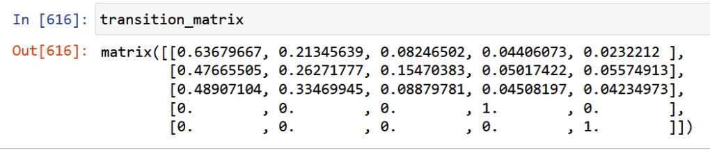
Debt status AAA AA B C D AAA 0.64 0.21 0.08 0.04 0.02 AA 0.47 0.26 0.15 0.05 0.06 B 0.48 0.33 0.08 0.05 0.04 C 0 0 0 1 0 D 0 0 0 0 1 Transition matrix or the probability of movement among debt status in a trimester span. Also, stressing the initial model parameters, one can see that C and D are inalterable due to the «bad debt» label. Relevant Questions
With the prior accoutrements one can begin to make predictions and draw relevant conclusions for the decision takers.
1.What is the probability that an excellent debtor will fall into bad debt after one trimester? By a simple look at the transition matrix, one sees that around 6% of them will fall into arrears.
2.What is the probability that a debtor with initial AA will end up in B status at the end of the year?
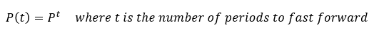
According to the succint corollary of the Kolmogorov-Chapman equations, one can impel forward any transition probabilities to future periods by just powering the transition matrix to that required period.
transition_matrix**3
A fraction over 8% will fall into arrears within 60 and 90 days.
3. What is the estimated total cost of bad debt recollection at the end of
the year considering the 800,00 fare?All needed to do in this point, is to add all of the fourth dates within
different emissions, which will amount to a total of $ 1.060,000As a concluding note, one ought to make sense of that last figure in tandem with the cash availability in terms of the amount repaid, amount falling into arrears, and the amount in stock.
Status: Beginning in month 0, A is the amount of money repaid; B is the amount unpaid, and C is the stock capital that has not been lent -
Freights in a sea fraught with frightening uncertainty
The following exercise involves information regarding Pacific sea freight operations of a mexican enterprise from the manufacturing sector. Due to confidenciality purposes, the dataset was construed through meager and rudimentary means; it was created by reviewing and manually capturing in a spreadsheet file the physical documentation from every purchase order (OC) carried out from November 2020 to October 2021, such as, invoices, packing lists, and Bills of Landing. Every record is a specific OC marked by its own denomination, Supplier, product name, description, Volume (cbm), total weight, Incoterm, invoice-value, Container number, dates (purchase, export, anchorage and plant arrival), whether its a FCL (20 or 40 footer) or less, amongst others.
The main drive for the building of this database was to keep track of every Asian imports docked in the port of Manzanillo, Mexico, and the subsequent analysis was elicited out of the chagrin stoked by all the pandemic turmoil in FBX01 index (Asia to North American West Coast) and its aftermath. The sudden elasticity of prices bore conspicuously upon the Company´s margins. Borrowing a loose 6 sigma template (Define, Measure, Analyze, Improve and Control), this case study will try to parametrize the stark fare fluctuations and rises through the employment of public data.
Firstly, we will sieve the messy csv-file through the R and pandas python library in a Jupiter environment with the purpose of determining the distribution of the goods, origin and a reasonable grasp for the entire collection.
import pandas as pd
import numpy as np
import matplotlib.pyplot as plt
po_dataset=pd.read_csv(r'C:\Users\Alonso\Desktop\compendium.csv')
#Now that we are able to read the file, we arrange the data by export date in an ascending fashion.
po_dataset_bydate=po_dataset[["OC","Fecha de embarque"]]
po_dataset_bydate=po_dataset.sort_values("Fecha de embarque",ascending=True)
# We need to know how much money amounts for the total dataset.
total_value=np.sum(po_dataset_bydate["Importe"])
value_tot_fcl=0
#A function will be required to read the entire file to divide the cargo between FCL and LCL, then divide its invoice percentagewise. Peering the file one notices that the main discriminator between both categories will be the instantiation of a lower or upper case «x»;therefore, two simple for loops will detect such character and add it to two different lists.
total_value=np.sum(po_dataset_bydate["Importe"])
value_tot_fcl=0
x=0
i=0
po_dataset["Descripcion carga"].apply(str)
po_dataset.set_index("Descripcion carga")
cargo_type=[]
fcl_dataframe_list=[]
lcl_dataframe_list=[]
for x in range(len(po_dataset)):
     a=po_dataset["Descripcion carga"][x]
     for i in range(len(a)):
if(a[i]=="x" or a[i]=="X"): value_tot_fcl=po_dataset["Importe"][x]+value_tot_fcl fcl_dataframe_list.append(po_dataset["OC"][x]) break else: lcl_dataframe_list.append(po_dataset["OC"][x]) fcl_dataframe=po_dataset[po_dataset["OC"].isin(fcl_dataframe_list)] lcl_dataframe=po_dataset[po_dataset["OC"].isin(fcl_dataframe_list)] value_tot_lcl=total_value-value_tot_fcl data_prop={'fcl':[value_tot_fcl/total_value100], 'lcl':[value_tot_lcl/total_value100]} percentage_dataframe_cargo=pd.DataFrame(data_prop) full_perc=value_tot_fcl/total_value100 less_perc=value_tot_lcl/total_value100#The output will be the following: 82% of the cargo is containerized amounting for $15,146,273.

#Graphic visualization
import matplotlib.pyplot as plt
plot_data=[value_tot_fcl,value_tot_lcl]
etiquettes=["FCL","LCL"]
plt.title("Type of cargo")
plt.pie(plot_data,labels=etiquettes,autopct='%1.1f%%', shadow=True,startangle=90)
plt.axis("equal")
plt.show()
#Because of the preponderance of Containerized cargo, all of the LCL goods will be ruled out of the study. Next, we will need to divide the data into a dataframe for all the full container dataframe.
def cargo_division(po_dataset):

        value_tot_fcl=0
        total_value=np.sum(po_dataset_bydate["Importe"])
        fcl_dataframe_series=[]
        for x in range(len(po_dataset)):
            a=po_dataset_bydate["Descripcion carga"][x]
            for i in range(len(a)):

                if(a[i]=="x" or a[i]=="X"):
                    value_tot_fcl=po_dataset_bydate["Importe"][x]+value_tot_fcl
                    fcl_dataframe_series.append(po_dataset_bydate["OC"][x])
                    break


        po_dataset_bydate.set_index("OC")
        fcl_condition=po_dataset_bydate["OC"].isin(fcl_dataframe_series)
        #lcl_condition=po_dataset_bydate["OC"].isin(lcl_dataframe_list)
        fcl_dataframe=po_dataset_bydate[fcl_condition]
        #fcl_dataframe["Fecha de embarque"]=pd.to_datetime(fcl_dataframe["Fecha de embarque"], format="%d/%m/%Y")
        #lcl_dataframe=po_dataset_bydate[lcl_condition]

        value_tot_lcl=total_value-value_tot_fcl
        data_prop={'fcl':[value_tot_fcl/total_value*100],
        'lcl':[value_tot_lcl/total_value*100]}
        fcl_dataframe["Descripcion carga"].apply(str)


        return fcl_dataframe

full_container=cargo_division(po_dataset)
#Output of the full container dataframe
#Graph of cargo: There is no much difference between both container types.
import matplotlib.pyplot as plt
plot_data=[value_tot_fcl,value_tot_lcl]
etiquettes=["FCL","LCL"]
plt.title("Type of cargo")
plt.pie(plot_data,labels=etiquettes,autopct='%1.1f%%', shadow=True,startangle=90)
plt.axis("equal")
plt.show()
Distribution by ports
All of the providers are located either in India or in China. The proceeding layer of analysis will be to review the percentage distribution of invoice-values within the departure ports.
#We create a function to extract all sales done through the FOB regime
FOBS=twenty_forty(fcl_dataframe)

def fob_incoterm(FOBS):
    FOB_dataframe=FOBS[(FOBS["Incoterm"]=="FOB")]
    return FOB_dataframe

fob_incoterm(FOBS)
#Percentage distribution of the ports
fob_ports=fob_incoterm(FOBS)
port_counts=fob_ports["Puerto de Partida"].value_counts(normalize=True)
print(port_counts)
From the previous image, one can visualize that four ports account 85% of the total inventory. The next stage is the creation of a dataframe that will serve as a time series with two main parameters: total freight cost, and the number of containers on a monthly-basis.
#Transform fob_dataframe with the following parameters: for the indexation of the data series, one applies the «year-month» series; the count of units chartered per period, the number of single containers required; finally total freight expenditure .
fob_dataframe=fob_incoterm(FOBS)
fob_dataframe["year-month"]=fob_dataframe["Fecha de embarque"].dt.to_period('M')

container_counts=fob_dataframe.groupby(["year-month"])["No. De Contenedor"].count()
container_conts=fob_dataframe.groupby(["year-month"])["No. De Contenedor"].nunique()
container_conts_month_dataframe=pd.DataFrame(container_conts)
tot_freight_month=fob_dataframe.groupby(["year-month"])["Importe Flete"].sum()
total_freight_month_dataframe=pd.DataFrame(tot_freight_month)
#We write the function into a csv file.
print(container_quantity_totfreight_month_dataframe)
container_quantity_totfreight_month_dataframe.to_csv(r'C:\Users\Alonso\Desktop\container_quantity_totfreight_month_dataframe.to_csv')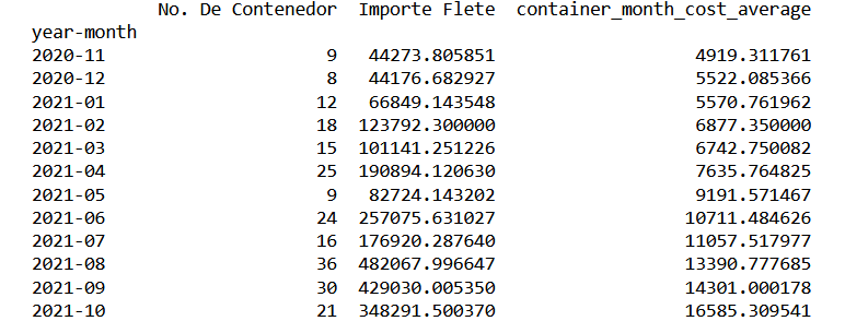
import matplotlib.pyplot as plt
average_freight_series_data=container_quantity_totfreight_month_dataframe["container_month_cost_average"]
average_freight_series_data.plot(x="year-month",y="container_cost_average",kind="line",marker="o")
plt.ylabel("United States Dollars")
plt.xlabel("Month")
plt.title("Average freight Evolution")
plt.show()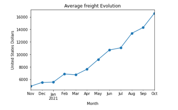
#Freight evolution per port.
container_tot_month.to_csv(r'C:\Users\Alonso\Desktop\ports.csv')
ports_plot_dataframe=pd.read_csv((r'C:\Users\Alonso\Desktop\ports.csv'))

ports_plot_dataframe.set_index('year-month',inplace=True)
ports=['Ningbo','SHANGHAI','Qingdao','NHAVASHEVA, India']
ports_plot_dataframe_limited=ports_plot_dataframe[ports_plot_dataframe['Puerto de Partida'].isin(ports)]
ports_plot_dataframe_limited.groupby('Puerto de Partida')['average_cost_freight'].plot(legend=True,subplots=False,marker='o',figsize=(20,20))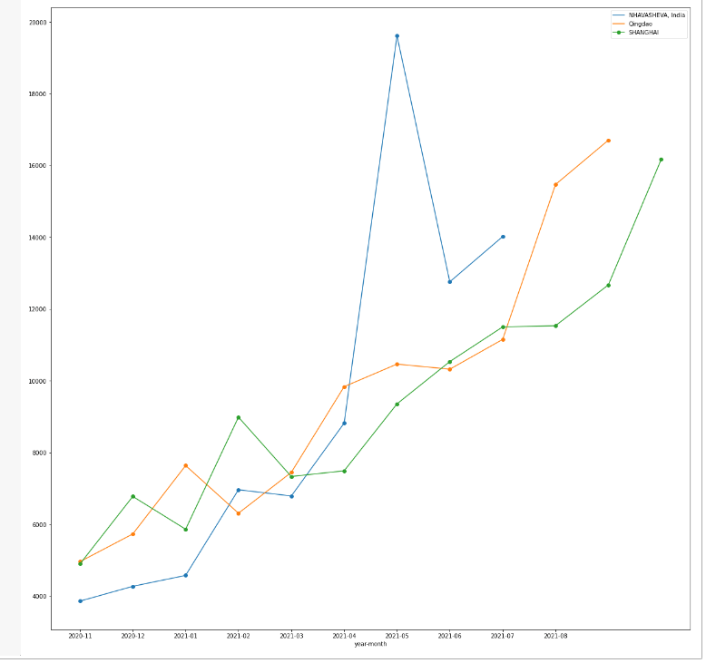
From the previous plot, one can appreciate how freight prices peaked around April and May 2021, for the particular west indian port of Nhava Sheva, as a probable direct consequence of the Evergiven Incident that took place at the end of March.
Departing from the aforementioned broad and explanatory strokes, one ends up with several misgivings stemming out of the ricocheting prices without prior notice. Retaking the initial proposition, the conundrum will be framed within the Six Sigma methodology; beginning with a problem statement: In less than 10 months, we have seen the doubling of the Pacific rate, which will percolate into the tax and duties paid at mexican territory, and eventually chafe companies margin.
The pretension will be to find a macroeconomic factor that will endow analysts a reasonable forecast for further periods; such factor, will be the issuing of currency. Following a conservative lecture on monetary theory, one learns that an increase in money supply will crank up inflation across all goods and services. Given the North American location of the port of Manzanillo, one can assert that the USA exerts single handedly the most overwhelming influence upon the FBX01 index; thus, one can surmise that its monetary policy will be the most crucial fare driver within the scope of this case-study, also, its a well espoused fact that during the pandemic, the government added 3 trillion dollars into circulation; this influence will be tested in the form of money creation during the data set timeline; this data will be extracted from the fred.stouisefed.org website.
Measure: Linear regression model
For the second stage of the Six Sigma praxis, a linear equation will be created; utilizing the average container fare per month as a response variable and the monetary mass as predictor or independent variable. The model mechanics will be to compare the current average container price with the monetary mass of the previous month. In order to have more manageable information and less difference in orders of magnitude, the monetary mass will be measured in a per-capita basis using a total population of 329500000.
#Data transformation for the model
usd_circulation_data=pd.read_csv(r'C:\Users\Alonso\Desktop\usd_incirculation.csv')
from matplotlib.legend_handler import HandlerLine2D
us_population=329500000
usd_circulation_dataframe=pd.DataFrame(usd_circulation_data)
usd_circulation_dataframe["monetary_mass_per_citizen"]=usd_circulation_dataframe["currency_emission"]/us_population
usd_per_capita=usd_circulation_data.monetary_mass_per_citizen
month=usd_circulation_dataframe.month
print(usd_circulation_dataframe[["month","currency_emission","monetary_mass_per_citizen"]])
monetary_mass_plot=usd_circulation_dataframe.plot(x="month",y="monetary_mass_per_citizen",kind="line",marker="o")
plt.ylabel("USD")
plt.xlabel("month")
plt.title("Monetary mass per person")
plt.legend(handler_map={monetary_mass_plot:HandlerLine2D(numpoints=13)})
plt.show()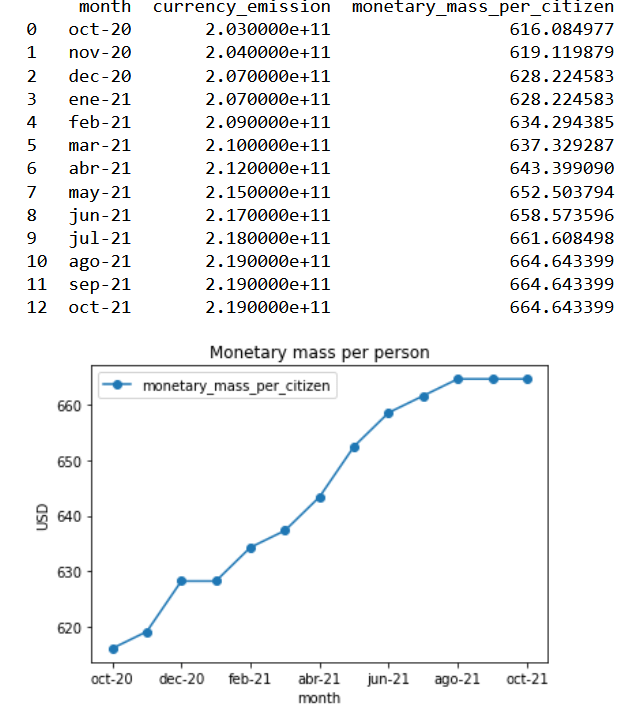
#Visual correlation of the two variables
freight_predictor=np.array([average_freight_series_data])
independent_variable=np.array([usd_circulation_dataframe["monetary_mass_per_citizen"][0:12]])
plt.scatter(independent_variable,freight_predictor)
plt.ylabel("Price per container(thousand dollars)")
plt.xlabel("money supply per capita")
plt.title("Scatter Plot:Container-Freight price/monetary mass supply")
plt.show()
Model in Rstudio
x_data<-x_variables$monetary_mass_per_citizen
y_data<-y_variables$container_month_cost_average
linearmodel<-lm(formula=y_data~x_data)
print(linearmodel)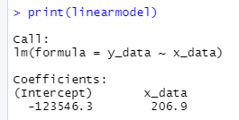

With the previous p-value, we can reject the Null hypothesis and conclude that the printing of money does have an impact upon freight prices.
Analyze
In this part, the model´s statistical rigour and validity will be put to a test by evaluating the output parameters. Initially, we have the Adjusted R-squared value: .9008, this tells us that the monetary input per capita explains 90% of the freight fare variation, so we can conclude that the model is quite optimal.
Testing the assumptions of the model :
Normality of the residuales
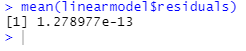

From the previous mean of the residuals and histrogram, one can concludes that it follows a normal distribution, as most values cluster around the mean.
Homocestaticity
At this point, one tests whether the residuals and the fitted values have the same variance.
var.test(linearmodel$residuals,linearmodel$fitted.values)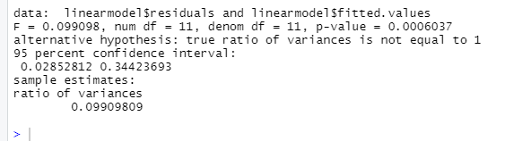
Given this last output, one can conclude that the model is not rigorous enough by having a confidence interval different than one.
Improve
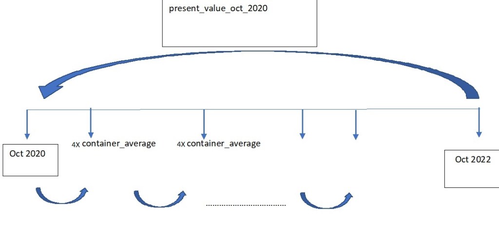
Proceeding with the monetary reading referred to earlier, after a period of bustling consumption like the experienced during the en masse printing of money of the last months ; subsequently applied policy is the escalation of interest rates in order to incentivize savings. The inextribable links between United States and Mexico alluded in the FBX01 index are also shared with the interest rate positions. On this improve section, the purported goal ought to be the acquisition of a treasury bond product that will have provided the company with a hedging slack against stark price shocks. To assess the effectivity of this stratagem, two vectors will be created; the first one involving the total expenditure per month incurred; second the interest rates for every month in the previous vector (researched from the internet). All of this expenditures will be taken to a October 2020 in a present value basis, which is exemplified by the following image.
Create an R vector utilizing the csv file, «container_quantity_totfreight_month»
vector_container_cost<-c(container_quantity_totfreight_month_dataframe$Importe.Flete)
print(vector_container_cost)
Create discount factor:
i<-c(0,.0448,.0448,.0452,.0428,.0428,.0428,.0452,.0451,.0475,.0475,.04997)

discount_vector<-(1+i)^-(1:length(i)-1)
discount_vector
Define Present value for October 2020
PV_oct_20<-sum(discount_vector*vector_container_cost)
PV_oct_20
We get a total logistical cost at an October 2020 value of 1664775.00 USD.
Financial Product
As stated in the Improvement core, one intends to buy treasury that could be monthly compounded from October 2021 to October 2022. The amount invested should be defined from the results of the analysis. As an initial step, one gets the total amount of container employed in that year.
sum(container_quantity_totfreight_month_dataframe$No..De.Contenedor)
The October present value will be divided by this last factor as a straightforward container average value, which results in 7465.35 USD
By investing the equivalent of 4 containers every month and allow it to compound with the interest rate vector, just as the cash flow diagram above.
future_value_oct_22<-function(amount,i){
  p_0<-0
  for(i in (i)){
    payment_period<-p_0+amount
    value_investment<-payment_period*((1+i)^1)
    p_0<-value_investment


  }
  return(value_investment)
}
Finally, this last value should be discounted to the October 2020 base line; once that both parameters have the same time frame, we can determine the percentage of effectivenes reached with this simple hedging mechanic.
present_value_saved_oct_2020<-function(future_value_from_product,i_1,i_2){
  total_interest_vector<-append(rev(i_1),rev(i_2),after=length(i_1))
  fv<-future_value_from_product
  for(i in (total_interest_vector)){
    p_value_oct_20<-(fv)*(1+i)^-1
    fv<-p_value_oct_20

  }
  return(p_value_oct_20)
}

present_value_saved_oct_2020(future_value_oct_22(7465.359*4,i_2021),i_2021,i_2020)
From an overall logistical cost of $ 1664775, we were able to hedge 9.23% applying this treasure bond policy within a single year.
Conclusion
Radical and unpredictable freight ascensions are ineluctable, as their impact upon utilitarian indicators; yet one must strive to glean useful tools that will grant analysts with windows for visualizing these menacing tides. Albeit the statistical invalidity of the model, the macroeconomic variable of choice, «monetary mass per capita», does have a strong positive correlation with our objective variable. For the final Control stage, one sugests a periodical review of the currency emission, which will provide useful foresight and its consequential effect on interest rates will parsimoniously muffle these margin strikes for the immediate year.
-
Suscribirse
Suscrito
¿Ya tienes una cuenta de WordPress.com? Inicia sesión.
